NAME: DELIGHT ME
UX Research & Design
Skills: Research, lean canvas, usability testing, five-second test, A/B test, competitive analysis
Tools: Sketching, Axure, Usabilityhub.com
THE business PROBLEM: Landing Page issues
Delight Me is a goal setting platform for small businesses employees. It allows you to invite colleagues and friends as mentors. The product is virtually unknown, and going through an "intro to market" phase that requires frequent research and iterative testing. The founder was relatively new to the world of tech, and was looking for an insider's view of her product. She was new (and a bit hesitant) to User Experience. Overcoming that challenge required quantitative proof of what users felt. At the time there was an urgency for user experience to be implemented - the owner was burning through her funds fast, building a product with very little target market interest. I was brought in to initially examine the landing page.
THE APPROACH:
My first act was to understand the business, her aspirations for attempting to build a goal setting product, hurdles, as well as who I would be working with during my short time there. The lady I would be working with (Christine Williams) was brilliant and eager to jump into this project, and the developers were also open to the idea - which made it easier to bring the founder into the UX wagon later on. However, one of the first issues I noticed is that the product was trying to be too much to too many people at an early stage. I suggested that we take a moment and examine the product, capture the value, narrow down a target market, and understand competitors. This resulted in a simple, first iteration of a lean canvas (shown below). I also wanted to understand what kind of funds could be allocated toward user experience, and learned that most of her funds were going to developers - as it often happens with startups. So I knew that whatever guidance I provided had to be "scrappy," that meant not being able to provide incentives for participants in usability tests.
Lean Canvas
First, we worked a bit on identifying the problem that the product was looking to solve, which ultimately led to the unique value proposition that Delight Me provided a way for people to utilize their connections (e.g., mentors, friends etc.) to monitor their goals - making this a social goal setting product. We also looked into competitors such as MyFitnessPal which offer a more robust mobile platform than Delight Me had at that time. The other lean canvas markers such as Key Metrics and Channels were (at the time) to be brainstormed later as we learned more about the current product and how users felt. The primary goal of this lean canvas was to understand who would benefit the most from this product, and to gauge an interest in the product in the first place.

Learning from Users
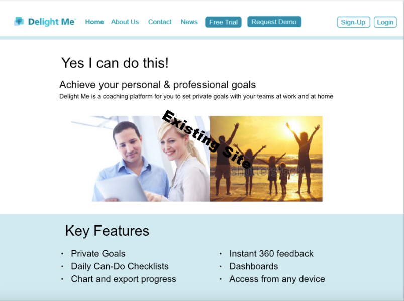
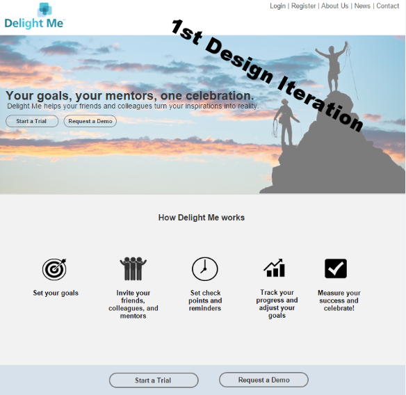
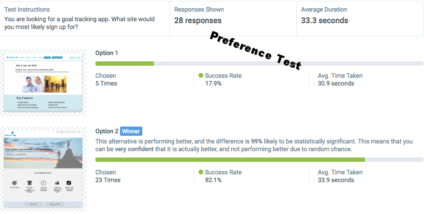
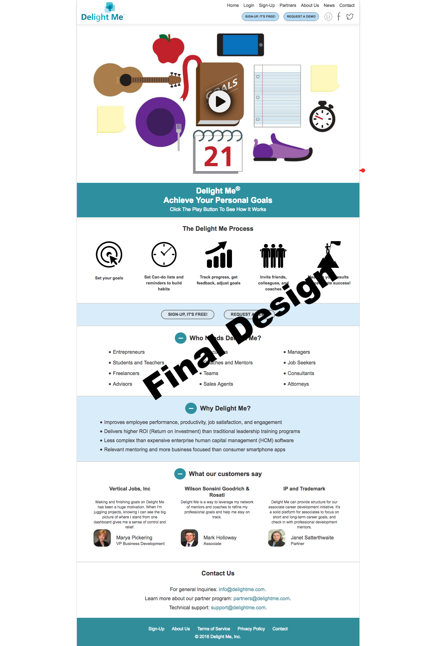
A quick look at the existing landing page told me that the first problem is that the target market, and the service that the product provided was unclear both in terms of the messaging, but also in the fact that the layout of the landing page was cluttered, and provided little visual guidance to the information that was actually important. In order to prove this point in a fast, cheap and quantitative manner I used Usabilityhub.com to run a quick 5-Second Test. What we discovered is that users were able to vaguely identify that Delight Me provided some sort of goal management or (more likely) a coaching or consulting service. What was most alarming however is that most users felt that the product appeared untrustworthy. So we set out to create a first iteration re-design of the landing page that provided a hero image with a message to users on what the product is and what to expect from it, followed by some quick descriptions (with icons) on the product's features. Once that was done we created preference tests using Usabilityhub.com to identify if our design was an improvement.


THE SOLUTION:
Iterate & Design
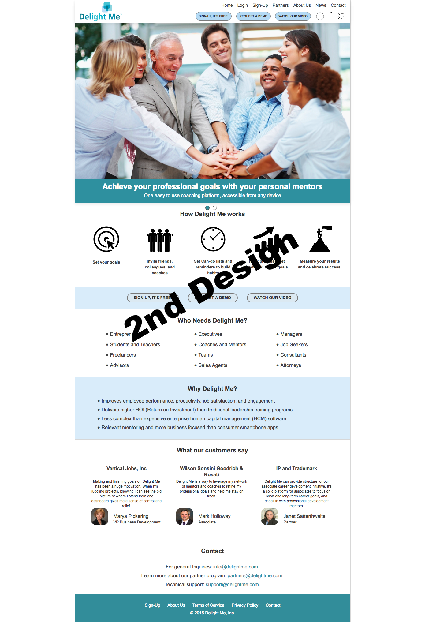
Once we established that our first iteration was relatively successful with users we begin to speak with a few users to discover what else we could improve on the landing page. We learned that users found the new design promising, and we allowed a few people to sign up for free to provide us with ongoing users for usability studies. At this time the founder had also narrowed down the target market to employees, and chose to market Delight Me as an employee-enrichment tool that business can use to empower users and improve productivity. This allowed us to focus on better images and messaging for the newer design, and consider other options such as a video that highlights the product's features. Overall, the landing page was much improved.
Next Steps: Digging into the site
Usability Studies & Social Media
Once the landing page was redesigned, I begin to step away from the project but continued to provide guidance on writing scripts for usability studies, and occasionally running an usability study as a second tester (see test). We begin to look at the internal site to assess whether or not users were able to easily complete a simple task such as creating a goal in the system (see click-test below). You can see that users were confused as to where to click to start the process of creating a new goal. Based on the usability studies, we discovered that a lot of work was needed on the internal site as well, as most users felt confused about the process of creating and monitoring goals and felt that the site was cluttered. However, I unfortunately had to leave the project. Before I left, I developed an initial social media campaign to help the team push the product into the world.
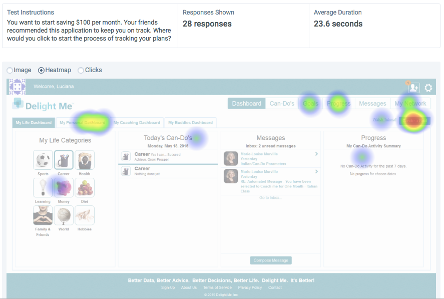
I created this simple click test to measure whether or not users were able to perform a simple task - creating a goal. As you can see, the site is inundated with navigation and options, making it difficult for users to assess where to click. In addition, we learned the terms such as "Can-Do's," "My Life Dashboard," and other terms were unclear to users. It was not clear to users that they were able to be a coach/mentor to someone else as well as monitor their own goals. The bottom row or footer has mixed messages of what a user is supposed to expect from this product. For example, what does "better data" have to do with a user's setting a goal? My recommendation was to get to a point where users have a few tasks that they can do per screen - and only the most important tasks. In other words, Delight Me needed an overhaul of the design and an evaluation of what a minimum viable product should provide, or better yet - go mobile first in order to help assess what the most important features are.